There are many distributions that are available within the base R Statistical System and it is possibly to use these functions to visualise the density or cumulative density functions for a distribution with a given set of parameters.
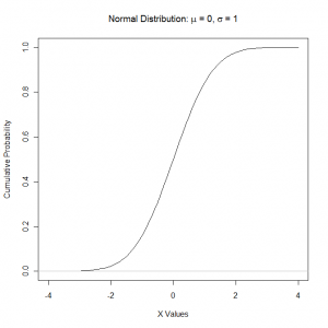
To illustrate this we could the standard normal distribution which has zero mean and variance of one and the cumulative density function has the familiar S-shape. To plot the distribution on a graph we first create a variable to store the values for the distribution, which we set to be a sequence ranging from -4 to +4 and save the data to a variable tempX so that it can be used in the plot function:
tempX = seq(-4, 4, 0.1) |
The next step is to call the plot function and we provide a list of X and Y values that we want to plot against each other. In this case we have already defined the X values so we use the pnorm function to calculate the cumulative values at each of the X values that we have specified. We also set the text for the title and the two axis using the arguments main, xlab and ylab. We use the expression function to create a text string with Mathematical characters in it. The mu and sigma are converted to the corresponding greek letters. Lastly the option type = “l” is used to get the plot function to draw lines rather than symbols. Our final function call is:
plot(tempX, pnorm(tempX, mean=0, sd=1), xlab="X Values",
  ylab="Cumulative Probability",
  main = expression(paste("Normal Distribution: ", mu, " = 0, ",
sigma, " = 1")), type="l") |
We add a horizontal grey line at the bottom of the graph using the abline function:
abline(h=0, col="gray") |
The graph that is produced looks like this:

Plot of the Cumulative Standard Normal Distribution
We can use this approach to visualise the density or cumulative density functions of any distribution that is available in R.
