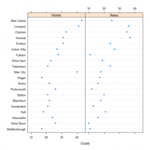
The dot plot was introduced by Cleveland to provide a powerful visual display to compare groups of data and a function for this type of graphical display is available in the lattice library for R. Data is divided into groups and dots are used to indicate the value of a particular variable with the groups arranged either horizontally or vertically to allow a visual comparison of the distributions for the groups.
We can consider the 2008/2009 English Premiership football season to produce a dot plot of the number of goals scored by each team home and away. To produce this display we need to undertake some pre-processing of the data to transfer from raw fixture results to summaries for each of the teams. The details of these processing activities will not be covered in this post. To use the dotplot function from the lattice library we need to specify varies arguments to the function. An example based on the football data might use the following code:
dotplot(Team ~ Goals | factor(Venue, levels = c("Home", "Away")),
data = goal0809.df) |
The first argument is a formula to specify the variables to use on the horizontal and vertical axes as well as, in this case, decreasing a conditioning variable. The formula specifies the variable to appear on the vertical axis to the left of the tilda and the variable to appear on the horizontal axis after the tilda. The vertical bar indicates that the variable(s) that follow are to be used to condition the data into subsets with a separate plot for each of the subsets.
For this example the teams are group on the vertical axis and the teams have been ordered by the total points for the whole season so we can investigate any relationship between points and goals scored. The graph produced is:
Panels can be arranged for more than one conditioning variable and not just for factors. A continuous variable could be divided into groups and then used as a categorical variable.


Hi,
Good plot. Do you know how to produce this plot so that the labels (ie. teams) are displayed on the right hand side of the plot (ie. right, y axis) as opposed to the left, where they currently are. Have been struggling with this for a while.
Thanks
CM,
I think you need to play with the scales argument to the function.
dotplot(Team ~ Goals | factor(Venue, levels = c(“Home”, “Away”)),
data = goal0809.df, scales = list(y = list(alternating = 2)))
Ralph