A bar graph is a frequently used type of display that compares counts, frequencies, totals or other summary measures for a series of categories, e.g. sales in different market sectors or in quarters in a financial year. The bar graph can be laid out with the categories either on the vertical or horizontal axis of the display – depending on whether we consider making a vertical or horizontal comparison is easier for interpreting the graph.
In R there are multiple ways for creating graphs, including the base graphics, lattice graphics and the ggplot2 grammar of graphics approach. To illustrate how we can create a bar chart using these packages we will make use of some data taken from the FAO statistics website for the UK in 2007. The data is for production (in metric tonnes) of the top five, in terms of production, food and agricultural commodities.
The first step before creating the graphs is to prepare the data in a format that can be used by the graphing functions. As this dataset is small we can manually create the data object. To make the labels on the graph less cluttered the production is recorded as 1,000s of metric tonnes.
The R code to create the data object is shown here:
uk2007 = data.frame(Commodity =
  factor(c("Cow milk", "Wheat", "Sugar beet", "Potatoes", "Barley"),
    levels = c("Cow milk", "Wheat", "Sugar beet", "Potatoes", "Barley")),
Production = c(14023, 13221, 6500, 5635, 5079)) |
The levels argument is explicity defined to make sure that the ordering is as required from largest to smallest production rather than being alphabetical which would be how the categories are ordered otherwise.
Base Graphics
Fast Tube by Casper
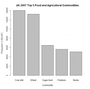
The base graphics in R provide a function barplot that we can use to create a bar chart. The first argument to the function is the name of the object with the data. The names argument is used to provide the labels for the categories in the graph. We also specify the text for the labels for the x-axis, y-axis and title of the graph with the xlab, ylab and main arguments respectively.
The function call is:
barplot(uk2007$Production, names = uk2007$Commodity, xlab = "Commodity", ylab = "Production (1,000 MT)", main = "UK 2007 Top 5 Food and Agricultural Commodities") |
to produce the following graph:
This graph is visually appealing with sensible space between the bars for the five commodity categories.
Lattice Graphics
Fast Tube by Casper
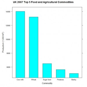
In the lattice graphics package the barchart function is used to create bar charts. The x and y variables are specified using a formula, which is the standard way when using Trellis graphics. The variable on the vertical axis is specified on the left hand side of the formula and the variable for the horizontal axis is on the right hand side, where they are separated by the tilda character.
barchart(Production ~ Commodity, data = uk2007, xlab = "Commodity", ylab = "Production (1,000 MT)", main = "UK 2007 Top 5 Food and Agricultural Commodities") |
This code produces the following graph:
The main visual difference compared to the base graphics example is the default colours for the bars which is much brighter than the base graphics example. There is also a large gap between the bars in the display.
ggplot2
Fast Tube by Casper
The create the bar chart in the ggplot2 package we use the ggplot function to specify the data to appear in the graph then gradually add in the other components of the graph.
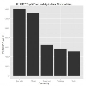
We specify the data frame where the data is stored and then use the aes argument to identify the x and y variables. The geom\_bar function is used to create a bar chart display with the specified data and the last three options in the example are for creating the various labels to be added to the graph.
The graph itself is constructed piece by piece to add the various layers and components on top of the base layer:
ggplot(uk2007, aes(Commodity, Production)) + geom_bar() + xlab("Commodity") +
  ylab("Production (1,000 MT)") +
opts(title = "UK 2007 Top 5 Food and Agricultural Commodities") |
This code produces the following graph:
The layout of this graph differs mainly with the grid background layout, which by default is a gray with white lines.
This blog post is summarised in a pdf leaflet on the Supplementary Material page.


